Choosing the Right Color Scheme for Your Restaurant’s Website
Your restaurant’s website colors say a lot about your brand. The right color scheme can draw people in, while the wrong one can turn them away. When picking colors, it’s important to consider your cuisine, atmosphere, audience, and goals to find the best fit. Follow some essential tips to choose a restaurant website color scheme that helps you connect with more hungry customers.

Use Colors that Reflect Your Dining Experience
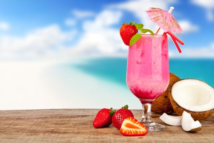
Your color palette should mirror what visitors experience when dining at your restaurant. Using colors and images that match your decor, menu offerings, and ambience sets accurate expectations. For example, a pasta place with red checkered tablecloths could use a rich red across their site. A beachside seafood eatery could incorporate ocean blues and sandy tans. And a French cafe could use stripes of black, white, and red.
Consider Your Cuisine Style and Offerings
Certain cuisines and dishes naturally pair with certain colors that you can carry through in your website design. Lean into these colors to reinforce your food to site visitors. Some examples include:
- Italian – Reds, greens, browns
- Mexican – Earth tones, red, green, yellow
- Thai – Red, green, yellow
- Seafood – Ocean blues, nautical colors
- Cheesecake – Creams, browns, purple
- Coffee Shop – Browns, creams
- Juices & Smoothies – Greens, citrus colorsHowever – these are just starting points. The specific tone and richness of each color is what will really make your site feel like your site.
Use Appealing, Appetizing Color Combos
Some colors schemes simply look delicious, while others dampen appetites. Choosing the right color combinations helps present your food in the best possible light. Vibrant contrasting hues typically work best to make dishes pop on your site. But you’ll still want some neutral backgrounds to prevent going overboard. Nobody wants to view unappealing color combos when food is on their mind.
Research What Colors Your Audience Responds To
Make sure to research what colors your target customers are most likely to find inviting when visiting a restaurant site. Fast food places may opt for more exciting, vibrant schemes that appeal to kids and teens. A restaurant targeting seniors may choose traditional, classic color sets. Consider running some quick surveys with patrons or looking at analytics on your current site to guide picking colors tailored to your patrons.
Reflect Your Brand Personality Accurately
Your color choices also indicate your restaurant’s personality and the feelings it evokes. Using colors associated with certain emotions and vibes helps shape perceptions about your brand. For example, black signals elegance for a high-end dining establishment while energetic reds sets an upbeat casual eatery mood. Select hues amplifying the exact atmosphere you want to achieve.
Use Contrasting Colors to Establish Visual Hierarchy
Strategically leveraging different colors also helps guide your site’s visual hierarchy – making key elements stand out while keeping supportive items receded. For example, bright accent colors overlaid on black and white photos will pull focus to vital call-to-action buttons. Contrasting colors applied wisely help visitor attention flow to your intended focal points.
Consider Color Psychology Implications
Remember that different colors impact us psychologically in subtle ways. While reactions are somewhat subjective person-to-person, general associations exist. For restaurants, warm tones like red and yellow spark excitation, citrus colors feel fresh, greens indicate health and nature, and browns convey dependability. Consider what emotional tones you want to achieve when selecting colors.
Test Different Color Palettes with Mock Site Pages
Is this a new grand opening, a new web site, or a redesign? Don’t rely on guesswork to determine your site’s colors. Design several test pages showcasing menu items, about sections, blog posts, etc. configured in different color schemes. Show these mockups to management or shareholders, maybe a group of trusted regulars depending on your set up, or even a random focus groups to collect feedback on what looks most appealing and aligned with your brand. Let these reactions guide perfecting your palette.
Check Colors on Mobile Devices Too
Mobile responsiveness means ensuring colors translate well to small screens too and remain legible. While a narrow three color scheme pops nicely on desktop, it may come across dull and flat on phones. Expand test palettes to 6-7 colors providing adequate mobile visual diversity.
Recheck Colors Annually to Stay Current
Regularly reevaluating colors keeps your site feeling fresh versus dated. Tastes change over time. The colors representing your restaurant now may not project the same vibes in two years. Set a reminder to reconfirm colors still reflect your brand accurately or explore refreshing your scheme.
The colors featured on your restaurant website influence user responses and engagement more than you may realize. Invest time upfront finding the optimal color combinations tailored to your cuisine, atmosphere, patrons and goals. Testing colors directly with mock web pages generates the best insights. Keep colors consistent across sites but flexible to allow future evolution. Choosing the right website color scheme drives immense impact toward effectively attracting and connecting with your hungry customer base.