
Are Rotating Sliders Losing You Customers?
Revolving sliders may seem flashy, but they often provide a poor user experience that hurts conversion rates. The sliding motion hides key information from users, who may miss the most relevant content for their needs. Without clear calls-to-action, users have no direction on what to do next. This disjointed experience frequently leads to high bounce rates, as frustrated visitors leave your site without finding what they need.
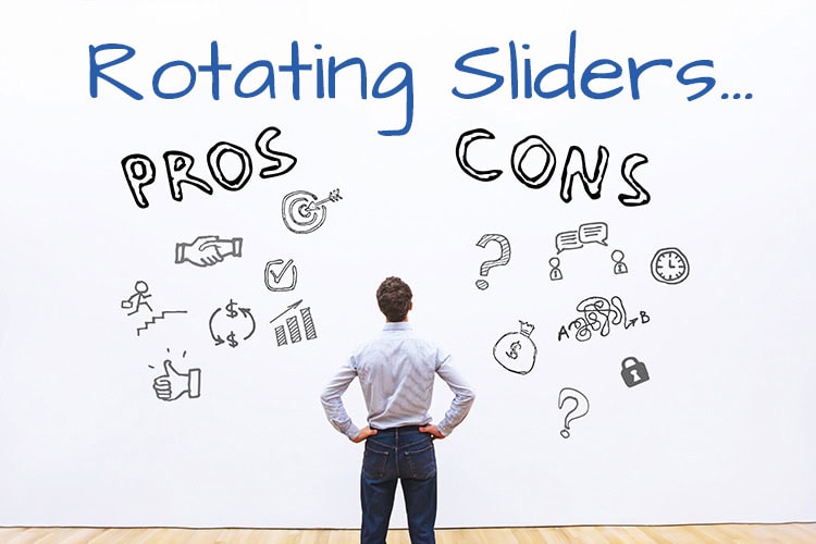
- Sliders are distracting. The motion draws the user’s eye away from the rest of the content on the page. This means they may miss important information.
- Sliders take up prime real estate. They often occupy the most valuable space above the fold. This space would be better used for clear messaging or calls to action.
- Indicators can be confusing. If you have multiple slides, the indicators showing which slide you’re on can be unclear and make users unsure where they are in the sequence.
- Difficult for mobile. Sliders don’t always translate well to mobile devices. The swiping motion doesn’t work as well on touchscreens. Mobile visitors may not realize the images slide or can be interacted with.
Sliders often don’t convert.
Studies show sliders have lower conversion rates than static hero images with strong calls-to-action. Users are looking to complete a task on your site. Sliders interrupt their journey, providing no clear path. This increases bounce rates as users leave out of frustration. Still unsure? Check out this perfectly crafted use-case slider.
Poor user experience. Sliders force users to wait for the images to sequence before viewing all the content. This feels disjointed and out of the user’s control. They may not see the most relevant slide for their needs. Or get tired of waiting and leave the site altogether. Providing all key information visible up front creates a smoother user experience. Instead of sliders, focus your high-value space above the fold on concise messaging, compelling visuals, and obvious calls-to-action. Guide your users smoothly through your site by showing your value proposition up front. If designed well, your landing pages will engage visitors and convert them to customers.
Here are some best practices for designing landing pages that convert:
- Have a single, clear call-to-action button above the fold. Make it contrast strongly in color from the background so it catches the user’s eye.
- Use headlines and subheads to quickly communicate your value proposition. Bullet points also work well to break up information.
- Include social proof elements like customer reviews, testimonials or trust badges when available. These build credibility and trust.
- Use high-quality, relevant images. Studies show pages with images convert better than text-only. But avoid stock photos that look generic.
- Reduce friction by minimizing required form fields. Only ask for essential info needed to complete the conversion goal.
- Use a clean, simple layout with ample white space. Avoid clutter that distracts the eye from important elements.
- Set up A/B testing to continually evaluate and optimize page elements for higher conversion.
- Make sure the page is mobile-friendly. Test on all devices to ensure a seamless experience.
To design high-converting landing pages, focus on creating a seamless user experience. Utilize your prime real estate above the fold for clear, concise messaging and a prominent call-to-action button. Include credible social proof and relevant images to build trust and engagement. Make your forms short and simple to reduce friction. And optimize the page with A/B testing for continuous improvement. A clean, focused layout with ample white space directs attention properly. Ensuring mobile-friendliness reaches all users seamlessly. Following UX and conversion rate best practices allows you to connect with visitors and guide them to become customers.